Aveksana

Company
Aveksana
Timeline
2 weeks
Role
UX Designer
Scope
Information Architecture
System Thinking
UI Design
Aveksana is an AI-powered research platform that helps students, researchers, and R&D teams navigate the research process, from finding topics to writing grant proposals.
This project focused on redesigning Artha, the platform’s proposal editor, where users review, edit, and refine AI-generated proposal drafts before exporting them to Google Docs.
My role was to redesign the editor experience to feel more intuitive, familiar, and supportive of the full proposal-writing workflow.
Business Problem
Users churned before using the editor features, leaving them unconvinced to convert
Although testers valued the AI-generated drafts, 3 out of 4 immediately exported them to Google Docs instead of continuing inside the platform. As a result, users churned before the editor's features had a chance to prove their value, leaving them unconvinced the platform was worth paying for.
pilot organizations onboarded
"Preparing for application grants can take weeks. With Artha, I built my application in less than a day."
– Emilia Koskiniemi, Taskhire Founder
Problem Framing
The AI output was valuable, the editing experience was not

To understand why users abandoned the editor, I analyzed user feedback, usability observations, and demo recordings. Due to limited feedback, I also triangulated the feedback from users by doing analysis of other editor platforms.
The findings revealed that users valued the AI-generated output, but struggled with the editing experience surrounding it. Three core usability problems emerged:
01
The editor felt unfamiliar
Users are accustomed to tools like Google Docs and Notion. Without a similar continuous document experience, they defaulted to exporting.
02
Collaboration was missing
Researchers don't write proposals alone. They work with PIs, team members, and external partners. The absence of collaboration was a hard blocker.
03
Navigation was unintuitive
Users didn't know how to move between chapters or what to do after reading the AI summary. The flow from generation to editing wasn't clear.
Together with stakeholders and engineers, I scoped the project around one clear goal: creating a foundational editor experience that feels intuitive and familiar before introducing advanced capabilities.
Inputs that were valuable but would add complexity without serving that goal were deliberately backlogged.
How might we…
Design an intuitive editor that supports the full proposal writing process – from first draft, collaboration, to finalization?


Solution Overview
One workspace, multiple capability.
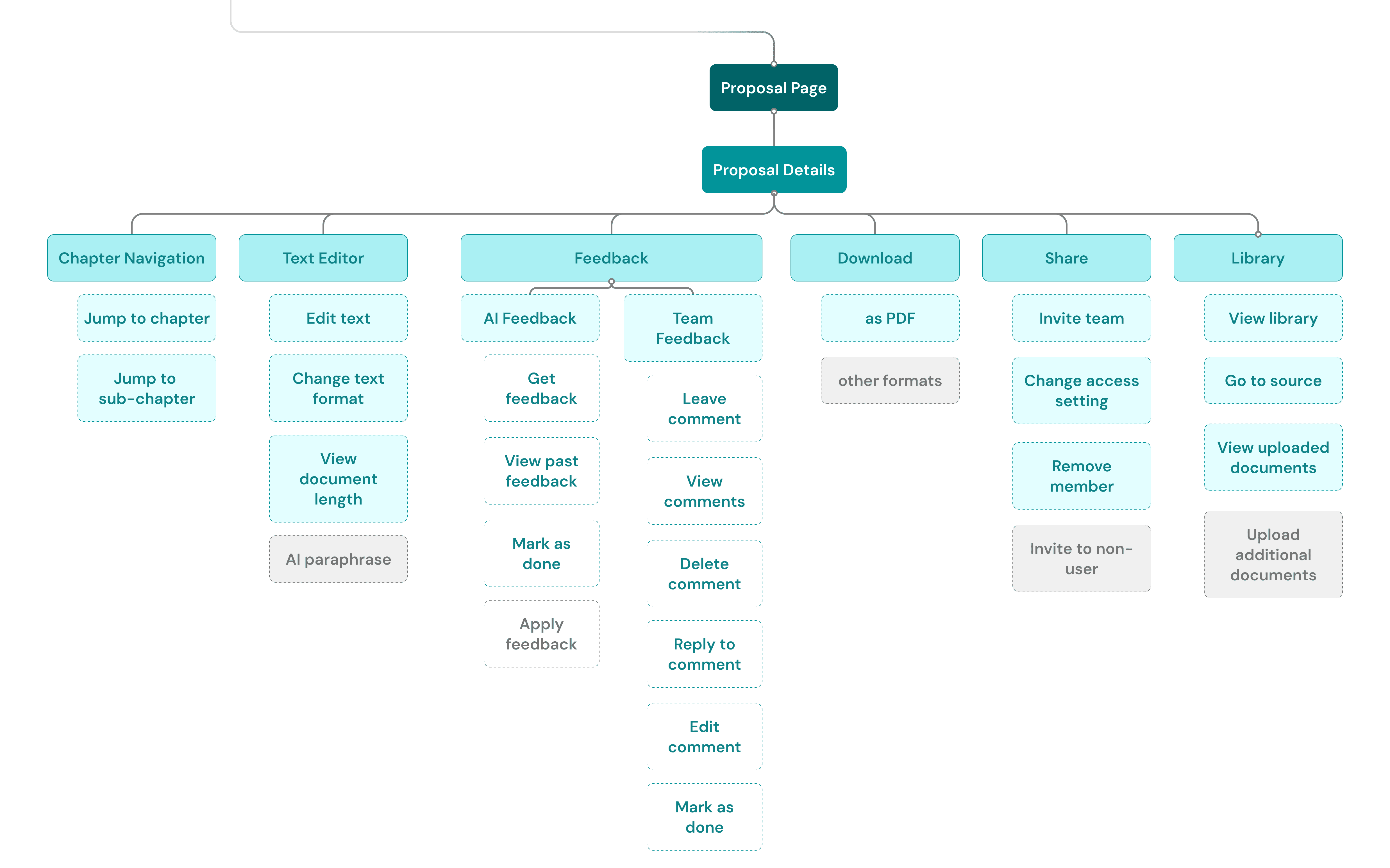
The three problems had different root causes: familiarity, collaboration, and navigation, so I needed the structure before the screens.
With the problems defined and the scope agreed, I triangulated user insights with interaction patterns from established editors like Google Docs and Notion, and then translated them into a structured IA.
I also mapped backlogged features within the IA to ensure the structure could accommodate future iterations without requiring a redesign.
Design decision 01
Layout stays flexible, but writing remains to be the centre stage
The editor adopts a layout users are already familiar with. Chapters sit under the toolbar, consistent with established editors like Google Docs and Jenni.ai. The feedback panel stays on the right, and the writing area remains clean at the centre. Each panel can be shown or hidden independently, letting users focus on what matters at that moment.
1
First Draft
2
Iterated Layout
3
Final layout

Design decision 02
Advocated for continuous scroll to keep the navigation familiar
Early in the project, engineers flagged that displaying all chapters as a single, continuous, scrollable document was technically difficult. Their preferred solution was a paginated, chapter-by-chapter view.
I immediately point out to both engineers and stakeholders that this is a non-negotiable requirement, as user feedback has shown they want something familiar, and the common interaction is that the editor is a single, scrollable document. Ultimately, the engineering team found a way to make the continuous view work.
Before

Users can only view one chapter at a time and cannot scroll to move between chapters.
After

Users can view the entire document in one scroll and move between chapters quickly.
Design decision 03
Feedback responds to where users actually are, not fixed
The AI feedback interaction had to handle two distinct scenarios: a first request and all subsequent ones. This needs to be handled carefully so that it wouldn't create confusion.
The previous version immediately generates new feedback every time users click the 'Get feedback' button. This prevents users from reviewing and comparing with the previous feedback.
I handled this complexity by only showing the latest feedback by default when users have already requested feedback at least once. Previous rounds are collapsed into an accordion, keeping the sidebar focused without losing the history.
Design decision 04
Mapped feedback states before designing, reducing reworks
The collaboration feature had to account for four intersecting variables simultaneously: who created the comment (user, collaborator, or AI), who is viewing, what state the comment is in (active, resolved, or editing), and what the current layout is (sidebar open or hidden, chapter selected or not).
Rather than jumping into visual explorations, I built a decision tree first. The combinations were too numerous to design accurately without a structure, and any gap would have created significant inconsistencies.

Design System
Ensuring scalability
To move fast within a 2-week timeline, I was deliberate about what to create from scratch versus what to extend from the existing design system. New components were only built when the interaction or state complexity genuinely required it.

AI vs human treatment
Distinct treatment (no reply option on AI feedback) signals the source
Clear status
New badge helps identify status, while thread keeps the context anchored
Takeaways
What it takes to design a complex system
System-driven decision
Understanding the entire system and mapping out the relation between objects first before jumping to the design phase kept the design process efficient.
Building a case with limited data
Triangulation of qualitative feedback, session recordings, and analysis of similar platforms can be an alternative to build a case strong enough to act on when primary data is limited.
Speaking stakeholders' language
Framing design decisions in the right language for each audience, i.e. logic flowcharts for engineers and ROI for stakeholders, is what gets alignment faster and keeps the project moving.


Rocky Paroky
Web Designer & Founder
Book a Call
Almost There!
work@rockystudio.com